How to develop a personal color palette.
Creating a new watercolor palette - Part 1

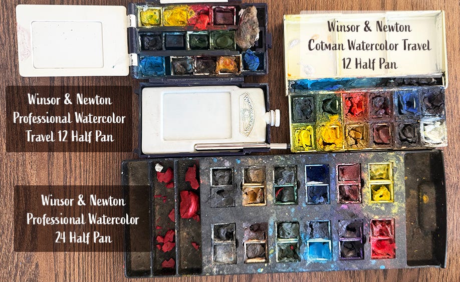
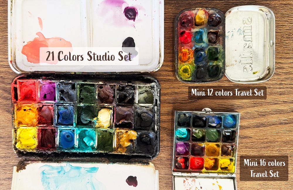
When I first dipped my toes into watercolor painting, I was just like many beginners, I started with a set of student grades watercolor - the Winsor & Newton Cotman Watercolor Travel 12 Half Pan Set. I got the Cotman during my college years while attending a summer program in Chester, England, and it quickly became my go-to. At the beginning, I mostly used it for quick travel sketches, diary entries, and jotting down homework ideas. I cherished that little set for many years, even as I began my journey into gallery painting.
Winsor & Newton's Cotman is a fantastic choice for student-grade paints! The pigments are nicely saturated, and the colors are bright and accurate. But as I started to do more gallery works, I needed to step up my game and invest in artist-grade paints. The main difference between professional-grade and student-grade paints is all about pigment quality. Student-grade paints are typically made with artifical chemicals to mimic natural pigments, which can result in colors that aren’t quite as intense or accurate. On the other hand, artist-grade paints use a process that includes more natural ingredients, leading to richer and vibrant colors with a wider range of values.
I switched to Winsor & Newton Professional Travel Half Pan for plein air paintings and the 24 Half Pan for studio work. Moving forward, all my gallery paintings are created using the 24 Half Pan.
Transitioning from Cotman to Professional paints had been a learning experience. The chemical composition of student-grade and professional pigments differs, so I've had to adjust my color mixing and application techniques. However, the purity of the artist-grade pigments gave me a deeper understanding of colors from a scientific perspective, which helped to improve my painting and coloring skills.
For many years, I stayed with the standard Winsor & Newton Professional sets. But, around the time I began my career as a full-time independent artist that a painter friend of mine encouraged me to explore creating my own personal color palettes. She shared a great tip: store-bought palettes often feature "primary" colors that are highly saturated and a bit too standard, which can limit mixing options.
Since my style leans towards the colorful and illustrative side, my work tends to feel a little "cartoony" and sometimes a touch oversaturated. That’s not necessarily a bad thing, but if I want to take my skills to the next level and add more depth and subtlety to my paintings, crafting my own palette could really help. Plus, having a personal palette is like having my own signature—it adds a unique touch and enhances my individual voice as an artist!

Crafting a personal color palette is much easier said than done. There are so many colors to choose from. Take the primary colors, for example; there are countless variations of yellow, red, and blue. Even if I tried to study the history and chemical makeup of every single pigment, it would still be overwhelming to create a brand new palette. So, I decided to learn from the masters.
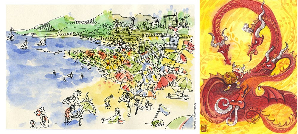
My immediate go-to is John Singer Sargent. I love Sargent's watercolor sketches and have always dreamed that if I could ever paint like him, I would be on cloud nine. I admire Sargent's playful impressionist brush strokes. When examining each stroke up close, they appear loose and carefree. However, once you step back and view the painting as a whole, there is a sense of photorealism while still capturing the emotion and energy of the painter.
I dove into his watercolor palette to discover why he picked certain colors, and it was really interesting! I learned that primary colors aren't always the best choice for creating a natural look. Instead, he focused on how well the colors blended together and the unique depth and variation they created on paper.
I researched his color palette and tried to find similar pigments in modern paints. Some paints from the early century are no longer in use or have changed over time. While some of his colors work well for me, others don’t fit my art style.
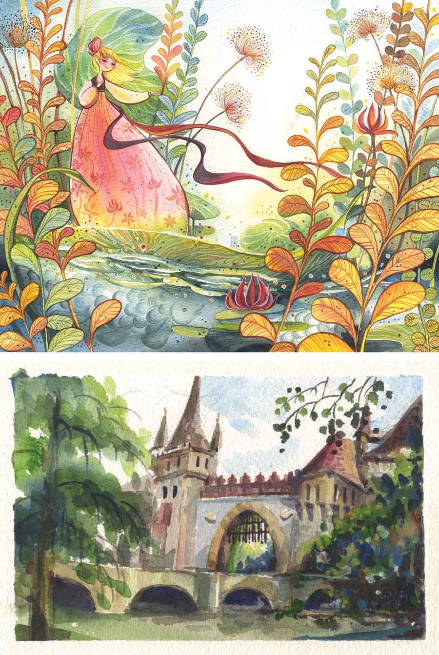
My next research focus is Winslow Homer. I am captivated by Homer's color palette; it is rich and expressive. At times, it feels highly saturated and colorful, yet it remains grounded in reality while also embodying a sense of poetic beauty. I took the time to study his color choices. Like Sargent, Homer demonstrated a profound understanding of how colors interact with one another during mixing.
Looking at the differences and similarities between Sargent’s and Homer’s palettes helped me figure out the direction I want to take with my own new palette.
At last, I developed a new color palette that combines elements from the palettes of Sargent and Homer, along with some adjustments based on my own color preferences. Since creating my personal palette, I have gained a much deeper understanding of colors and how to manage their range and saturation through mixing and combining them.

I have used this palette for all my books and gallery projects. But, lately, I feel the need to make some adjustments, so I am building a new palette. I will share more about how I develop my 2025 color palette in my next post.
Questions and Answers:
Where can I find the paints mentioned in the post?
You can find the paints I mentioned on my Amazon Art Supplies page.
Does the brand of paint really matter? Why do you use Winsor Newton?
There are many amazing art brands out there, and it's always exciting to try new ones. For me, Winsor & Newton stand out because of their fantastic quality and vibrant color pigments. I did try out other brands in the past, but I found that Winsor & Newton works best with my art style and painting habits.
Long answers short, you could use any brand you are already familiar with or love to build your palette. If you have a favorite brand of paints that you would like to share or recommend, please comment below!
What's the difference between tube paint and pan paint?
They are essentially the same; one is dry while the other is moist. I tend to lean towards pan paint because it’s just more convenient for me. I don’t have to keep reaching for the tubes when I’m in the groove of painting. Plus, I can easily refill my pans with the tube paint whenever I need to.
The great thing about watercolors is that you can easily revive them even after they dry, and it won’t affect the pigment quality at all! But if I'm working on a big painting that needs to cover a lot of area, I’ll choose tube paint for the quantity.
How many colors should you include in your palette?
There are no hard rules when it comes to choosing the number of colors! Some artists love the simplicity of a limited palette with just a few primary colors, while others really enjoy the freedom of a larger selection. You'll find that different groups have their own opinions on this, but the most important thing is to find what works best for you and your unique style. So, go with whatever combination feels right and fun for you!

I've been feeling a bit stressed with my book deadline this month. But I really enjoy those little moments of downtime when I can dive into other Kid-Lit Community creators' Substack posts. They always inspire me and help keep me moving forward with my project!
The Tea Salon
- How to Find Your Artistic StyleReading Ahead
- The Other Side of Tomorrow - How I signed my first book contract.Super Readers Club Jane Smith - Celebrate Every Little Good Thing
Mocculere’s Letters Mojca Novak - Comic #81 - Sleeping
Drawing A Blank Jacob Souva - A Matter of Perspective