After all that plein-air painting practice, I’ve started having some fun with poster colors in the studio, using a few of my upcoming group shows as a bit of a playground. Nothing gets an artist motivated like a little pressure—gotta learn on the go, right? LOL

I got these stackable ceramic palettes for the studio, and they are fantastic! Since poster colors can easily become muddy during mixing, using smaller individual plates for color mixing helps keep the colors clean.
Experiment 1
Every year, I look forward to joining the Salut Coaster show with Nuclues Portland. This time around, I decided to have some fun and create paintings using poster colors! The gallery group show is such a lovely space for me to experiment and try out new techniques and styles. I love that gallery art allows for a wide range of expression. Since I’m only working on a couple of pieces for this show, I don’t feel the pressure of needing to create a whole series with a consistent vision. Instead, I can focus on making each piece the best it can be while enjoying the process!
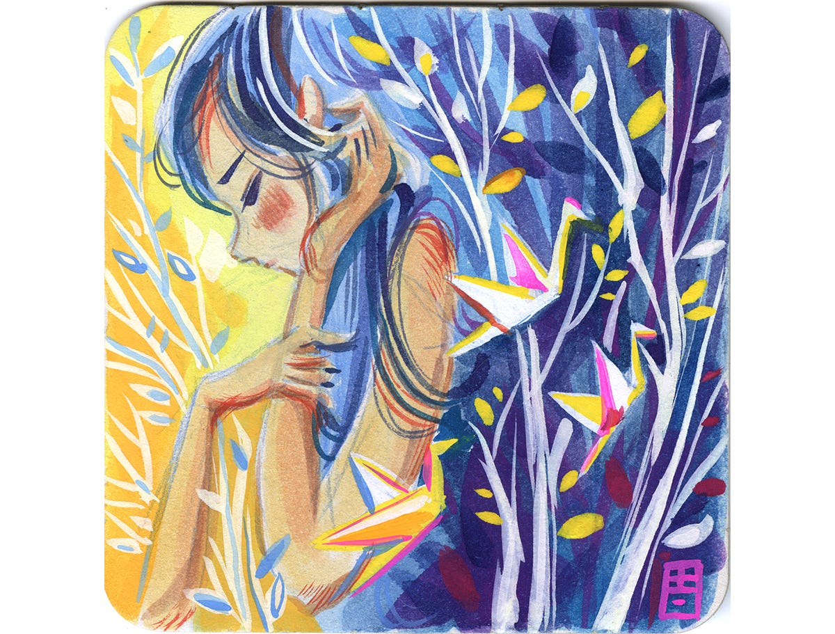
I approached this piece like I was using watercolors, but honestly, I didn't really take advantage of poster color like I should have. I played it safe by layering the colors from light to dark most of the time, just like I would with watercolors. It’s tough to shake off those old painting habits right away.
I don’t mind this piece, but I really think I should dive into the full potential of poster color. I mean, why use an opaque medium if I'm just treating it like it’s transparent paint?
Experiment 2
With art, it’s often helpful to let out all the good and the bad. The same goes for getting comfortable with a new medium. For my next experiment, I’m thinking of trying a full watercolor style but using poster colors and seeing what happens.
I decided to use another piece for my next art experiment. It’s this hamster-themed show at Cozy Day Gallery in San Antonio, Texas. I totally missed the submission deadline, but the gallery owner is super nice and gave me a three-day extension. Now the pressure's on! I need to come up with something fast!
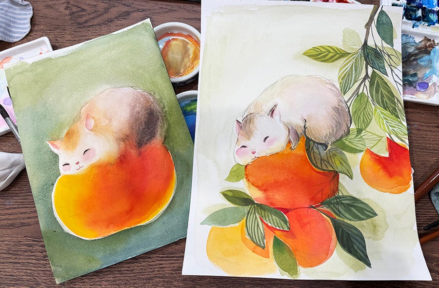
I figured painting a little hamster with watercolor techniques would be a piece of cake since watercolor is my go-to medium. How tough could it be to use poster color like a classic watercolor style?
Wow, was I wrong! I quickly learned that poster color doesn’t bloom and bleed like watercolor. The pigment is so much richer, and the water-to-paint ratio is totally different. To get that classic watercolor look, I either used way too much water or not enough. The edges ended up looking either stiff or completely out of control—not in that nice, happy accident way I was going for!
In art, failure can actually be a good thing sometimes! I mean, it can feel a bit stressful when deadlines are creeping up, and I start to worry about whether I can finish my painting on time. I can be pretty stubborn, too—once I commit to using poster colors, I don't want to switch to watercolors, even if that might help.
To tackle this, I love going online to check out other artists’ work for some fresh inspiration. I’ve decided to keep my design simple this time and focus on getting that paint-to-water ratio just right. It's all part of the creative process!
By my third try, I finally got a decent handle on the water-to-paint ratio and figured out how to manage the bloom and bleed effects with poster color. Even though I’m using a watercolor approach for this piece, it really helps me understand poster color better. It doesn’t look too different from my usual style, but this little experiment gives me more confidence in controlling poster color to fit my style. it helps me get a better grasp on how its pigments work.
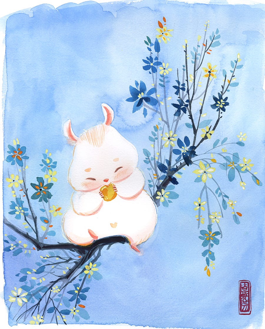
I’m really happy with the carefree bloom texture in the background; it gives off a classic watercolor look. Working with the leaves and flower petals has helped me get a better handle on controlling the opacity of the paints. This plant painting technique is my go-to for a lot of my watercolor stuff, and it’s a great way to figure out the right paint-to-water ratio while trying to achieve a similar look with poster color.
This painting is heading to Cozy Gallery (Cozy Day Art & Stationery
15909 San Pedro Ave, Suite 125, SAN ANTONIO, Texas) to make into prints, and now you can check them out there! If you're in San Antonio, Texas, and are into Japanese Anime, Manga, and kawaii stuff, you’ll totally dig the gallery. It's cute overload with Kawaii goodness!

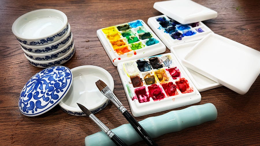
I really love using ceramic palettes for my poster colors! They’re way easier to clean than plastic ones. My faves are the stackable palettes with lids—they’re not just adorable, but they also save a ton of space. I can keep the paints that I'm still using in the stacked palettes and just slap on the lid. It keeps everything dust-free and stops any accidental mixing with other colors in the studio.
If you’re curious about the tools I use, check out my Little Art Supply Store on Amazon. I keep it updated with affordable, professional-quality art supplies!

🎨 Time to Upgrade Your Brushes?
I’m thrilled to partner with Golden Maple Brushes to bring you an exclusive 20% OFF their entire collection!
Use code Alina at checkout - no rush, no limits. Whether you’re stocking up or trying something new, now’s the perfect time to grab those dream brushes.
🖌️ Shop here: https://artgoldenmaple.com
Happy painting! 🥰