


Exploring new book illustration style!
With Nicker's poster colors 🎨

I'm working on my next picture book - Rainbow Grandpa, which was announced in Publisher Weekly a while back. For this one, I want to try a different art medium and style because I think watercolor and my usual approach wouldn't fit the story. As an illustrator, I believe it's super important for the story to influence the art style. So, for every book I make, I spend a lot of time - weeks, even months - doing visual research to dive deep into the story behind it.

With Rainbow Grandpa, I knew right from the start that I wanted to use an opaque paint medium for the illustrations. I've been digging into different brands of gouache, including acrylic and designer gouache. But strangely, it just doesn’t click with me.
I love mixing gouache with watercolor when I want some areas of my watercolor paintings to have a bit more opacity. I love looking at all the awesome gouache paintings created by other artists, and admire them. But oddly enough, when I try to make a painting that's just gouache, it just doesn't give me the same joy.
So, I decided to check out poster colors instead. I remember having so much fun with them when I was a kid. Back home, we used Sakura poster colors in art class, and I had such a blast that my mom eventually got me a whole box. I made all sorts of fun art and crafts with those! I didn’t know much about painting back then, but I loved how I could easily paint over colors. It let me create those soft pastel style for a Sanrio-style kawaii look or make something feel like my favorite Anime.
I started checking out Sakura poster colors, and it turns out they're often seen as kids' art supplies. I don't mind using stuff meant for kids - I love drawing with Crayola crayons - but there’s a big difference in pigment quality between student-grade and professional-grade paints. This can really change how colors mix and affect the overall hue and saturation of the artwork.
Then I remembered that Studio Ghibli uses poster colors for their background paintings, and it’s not just them; most anime studios do the same. They used Nicker’s poster colors, which are a professional grade paint.
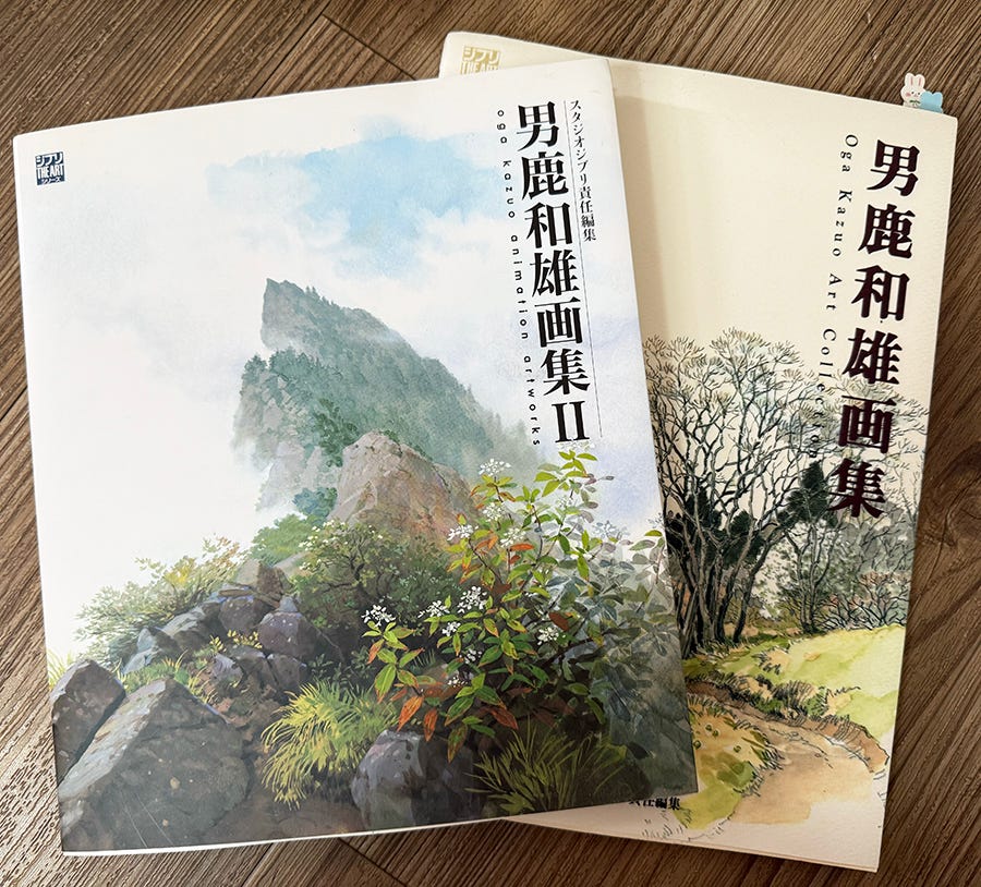
I pull out my Oga Kazuo art books. Oga Kazuo is the background painter and art director for most of Miyazaki's classic films at Studio Ghibli. The books are in Japanese, and for years, I’ve just been looking at the pictures. But this time, I decided to use my phone to Google Translate the book for the first time. He explains how to create watercolor effects, gouache looks, and even oil-like appearances using Nicker's poster colors. He also goes over how to mix those different styles! I got super excited and couldn't wait to give Nicker a try!
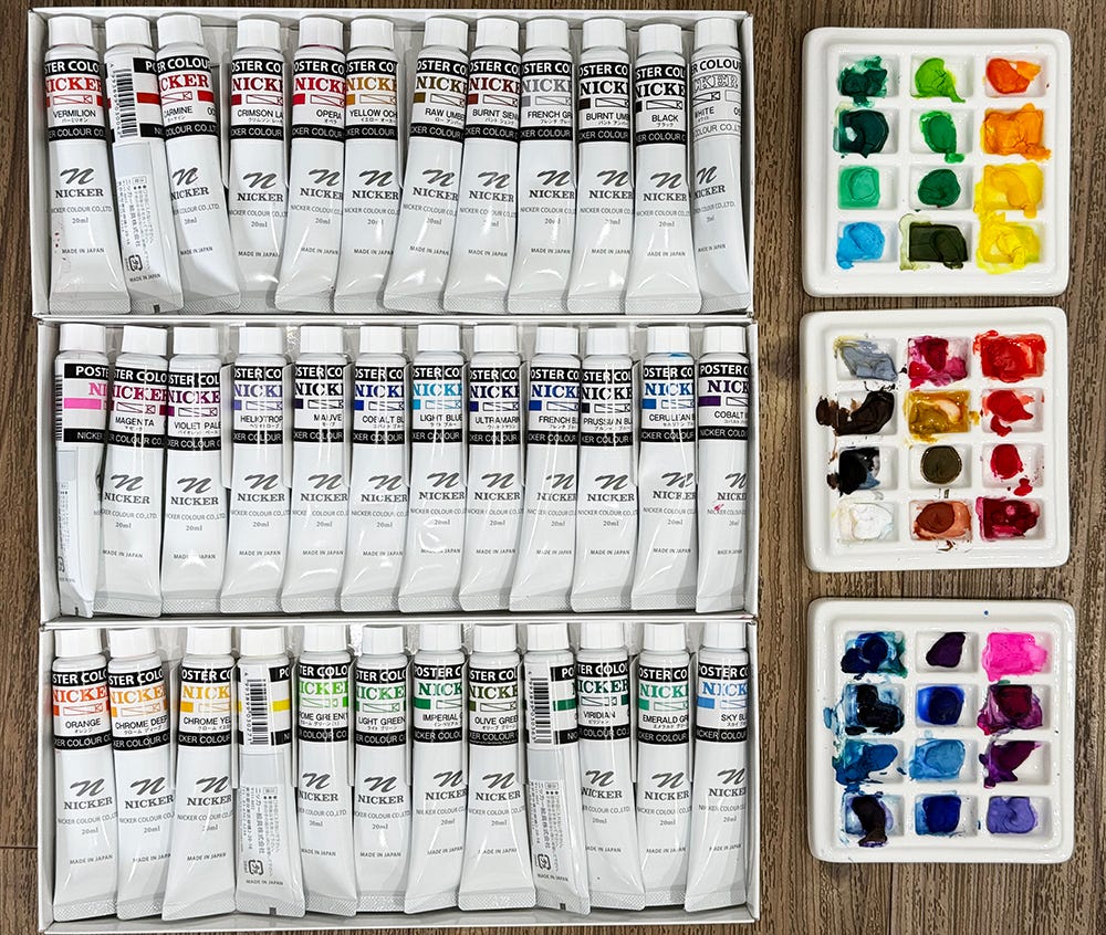
Poster color is a water-based paint medium, just like watercolor and gouache. The chemical components in poster color are similar to those in watercolor and gouache, but the main difference is that the pigments aren’t ground as fine. This makes it a bit more opaque than gouache, which is exactly what I want!
Painting with Nicker's poster colors is a new learning experience. The pigments are way more saturated than watercolor, so I’ve to figure out different color mixtures and "recipes" to create the color I want and rethink new approach of layering the paint.
I start with painting scenery from my neighborhood. I've noticed that I do way better when I just dive into the painting process instead of trying to remember things or come up with stuff from my imagination. This helps me focus on exploring new painting techniques. It’s a bit wild that sometimes, depending on the base color, using oil layering technique can work better than watercolor layering.
I also read and re-read Oga Kazuo's books multiple times because they really help me better understand how poster color works. His technique for layering colors is super insightful, but I'm not trying to copy Ghibli's style. I want to find my art style, not just for Rainbow Grandpa, but also for some other story ideas I've got brewing.
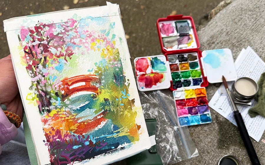
To achieve that I need to log more "painting mileage" with poster colors to find my style. So, I made a travel-sized painting set to practice plein air with these new paints.
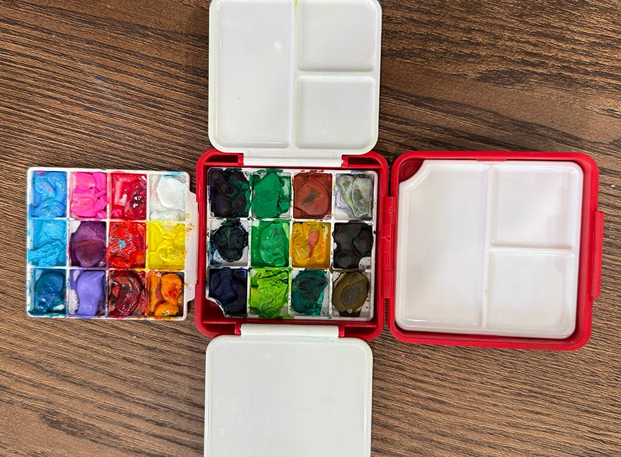
This set is super cute, but it’s not as practical as I thought it would be. I’ll have to build a traditional half-pan set eventually, but this one will work for now until my new palette box arrives. I went to Descanso Gardens for a spring painting trip with Piglet. The gardens look stunning this time of year with all the cherry trees and tulips in bloom!
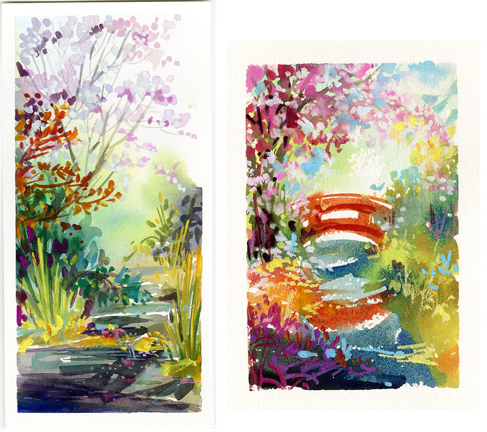
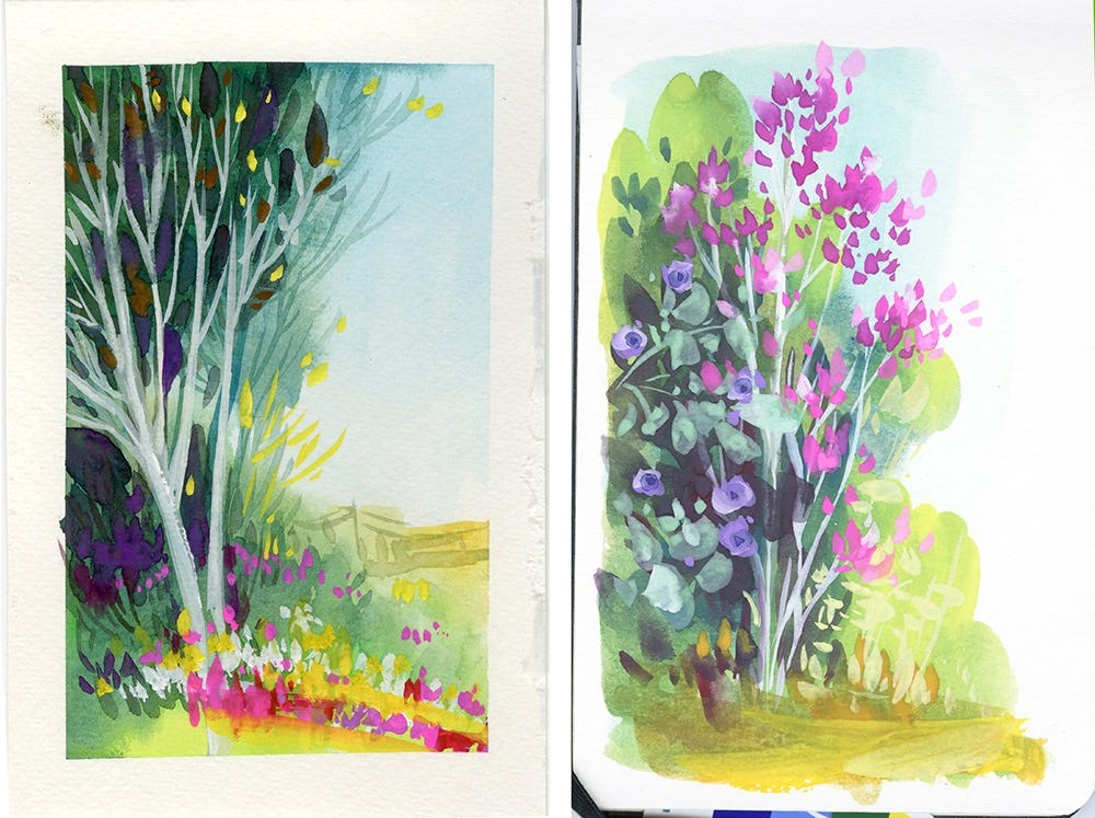
The sketch on the left is my first attempt. I did a pencil layout before I dove into the painting. The piece on the right, though, was made without any pencil sketch - I just went for it and painted directly with an oil painting approach. I kind of like it better this way. The painting feels more alive. Plus, it feels really refreshing to try a different painting approach!
I can't illustrate a book without sketching first, but this new way of mixing and layering colors could turn into somethings new. I’m looking forward to dive deeper into what I can do with it all.
I didn't get to paint or film my process this time. This new travel paint set isn’t super practical for painting outdoors. It’s tricky to hold onto, and if you drop it like I did, it just falls apart and the paints go everywhere. I even lost a purple when someone stepped on it! Ouch! Bye-bye, Poor Purple! 😢
So, this video is just a short vlog showing off the gardens. Aren’t they gorgeous?
If you want to check out Nicker's poster colors, you can find them at my Amazon Art Store!
Creative exploration is more fun when we share! What cool and exciting project are you working on right now? Please tell us in the chat or write in the comments! Let's celebrate and be creative together!

What a wonderful read! Thank you for sharing and congrats on the book!! so exciting. I am really interested in these paints now-- will check out your link :) Your paintings are just gorgeous.