I love designing endpapers for picture books!
End papers are more than just pretty packaging. We can do so much with them, especially in picture books. There are only so many pages in a book, so every page that can help enhance the story is extra precious. Endpaper design can be used as part of the story's narrative, like a prologue or epilogue or set the tone for the story to get readers excited to turn the page.
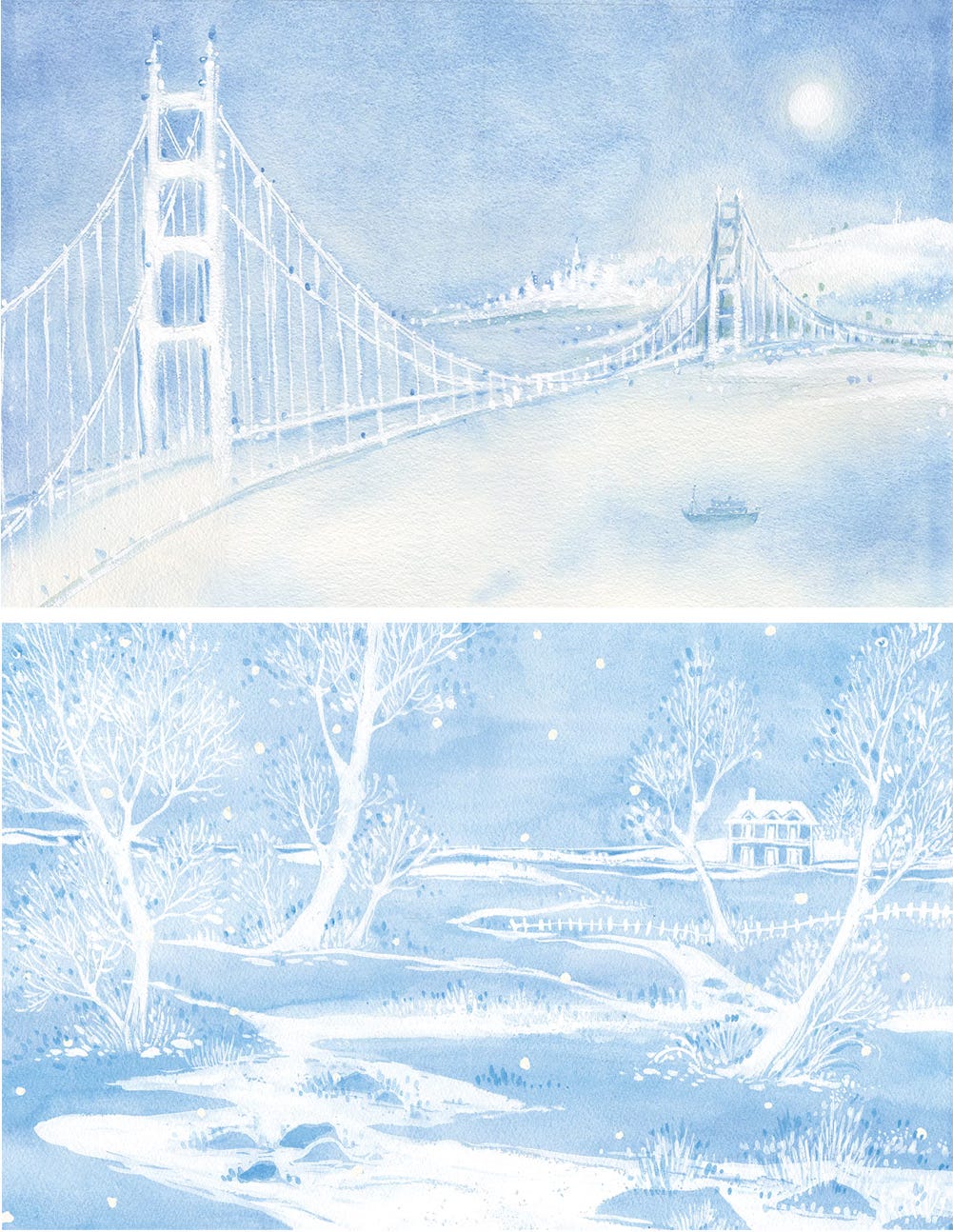
Double Happiness is a story about two siblings who relocate from San Francisco to Boston. I used the book's endpaper to set up the opening scene in San Francisco and conclude with a winter scene in Boston. The endpaper illustrations used the changing seasons to complement Nancy's poetic narrative and the story theme that even though endings can be difficult, they bring new beginnings, and happiness can be found in unexpected places.
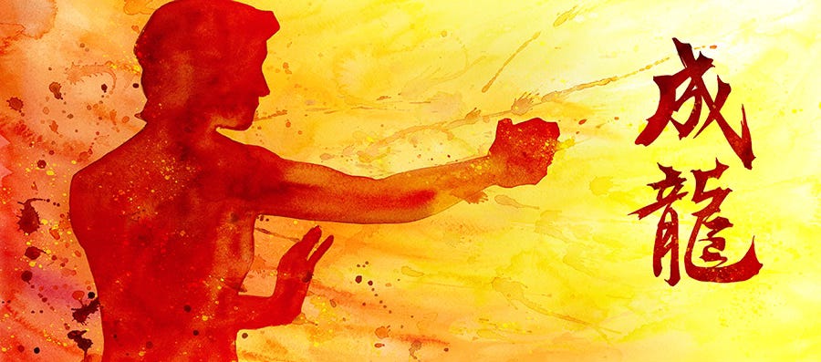
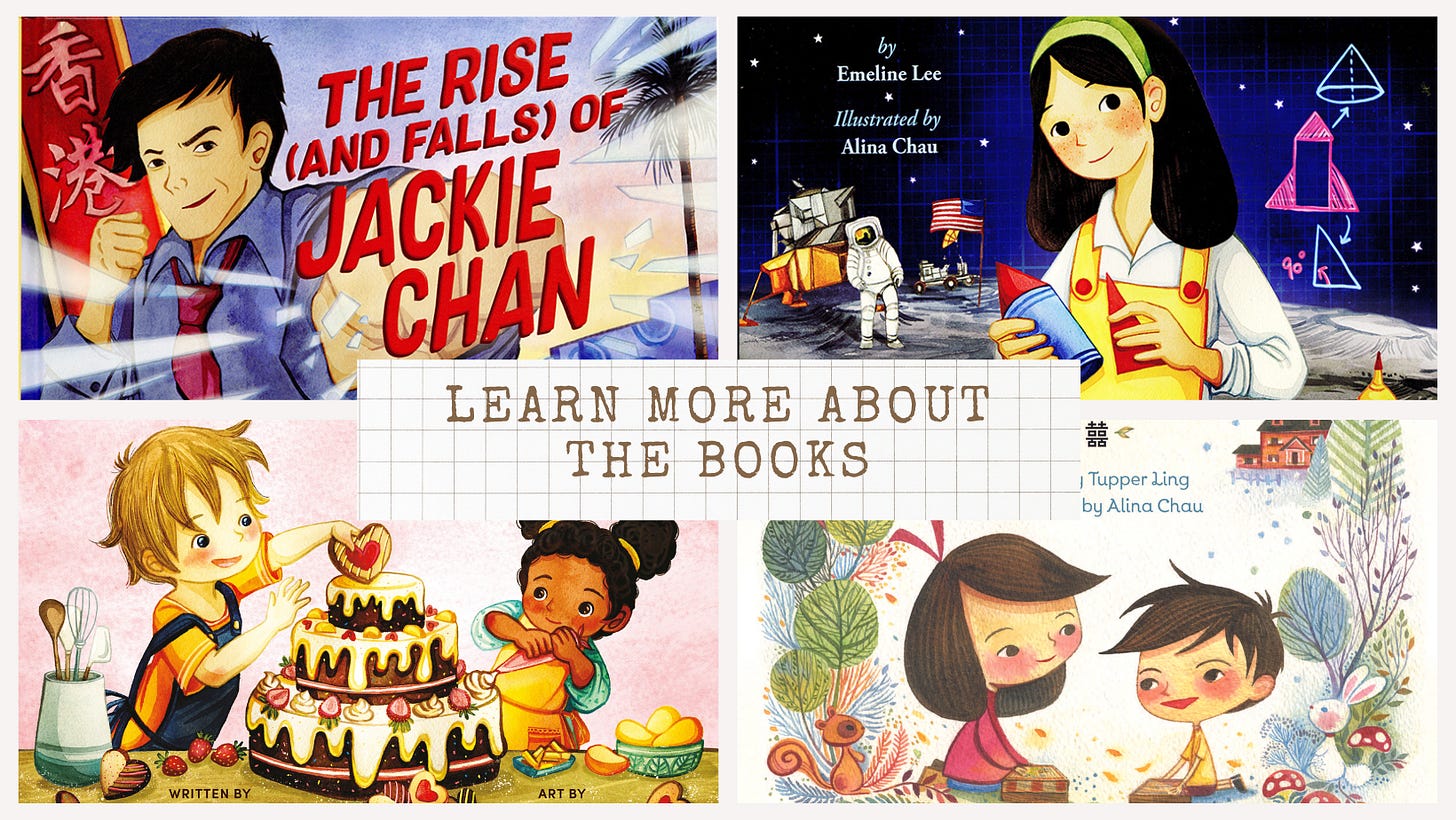
When illustrating The Rise (and Falls) of Jackie Chan picture book biography, I introduced the legendary actor using his Chinese name on the endpaper since there isn't a good space in the story illustrations to display Jackie's name in his mother tongue. I also had a lot of fun experimenting with a more expressive and creative style to illustrate Jackie's energy and action, setting up the action-packed tone of the story.
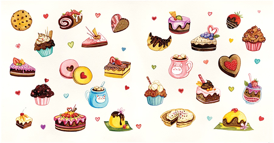
Love Like Chocolate is a heartwarming story about a family that uses baking to help an adopted child settle into their new home. The story is full of delicious treats for all kinds of special occasions. When I first read the manuscript, I couldn't help but think of all the cute desserts I could draw, but sadly, I couldn't fit them all in the book. But, the endpaper provided a perfect space to satisfy my sweet tooth and a way to use cute desserts to symbolize the characters' experience and the joy and sweetness that the story brings.
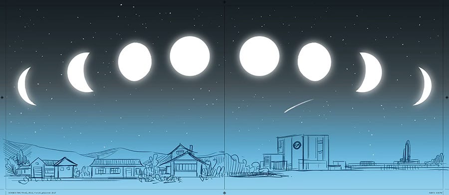
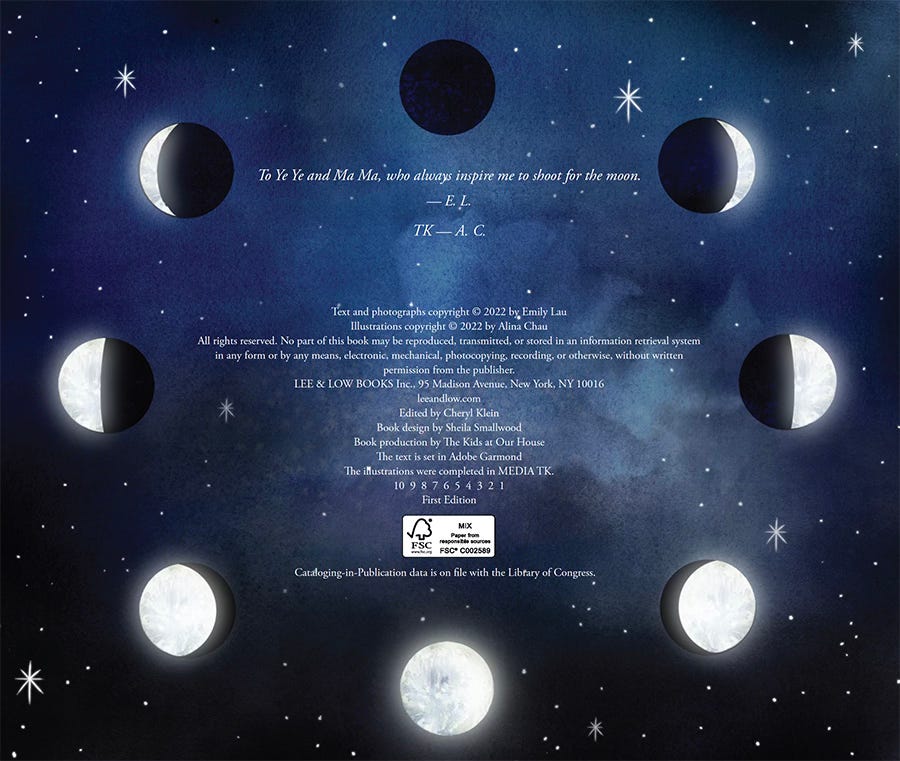
However, not all picture books have endpapers. Sometimes, publishers remove them due to budget constraints or page count limitations. When designing Bonnie's Rocket, I came up with an endpaper design that I thought was cool - it had Bonnie's home on one page and NASA on another to represent the two separate storylines in the book. Everyone loved the idea, but unfortunately, we had to remove the endpaper due to budget and page count restrictions. But you can't have a moon landing story without featuring the moon, right? So, we adapted the moon cycle for the copyrighted page instead.
In a book design, the endpaper illustrations are usually less fancy and colorful than the cover and story illustrations. But designing them is just as fun. For me, endpapers are like a "play area" in book illustration, where I can experiment and be super creative, brainstorming a variation of the book drawing style while keeping the story's consistency and flow.
The next time you flip through a picture book, don't forget to take a few extra moments to check out the cool endpaper design!
If you are attending ALA San Diego, please visit us at my Artist Alley table #123 or the Lee and Low Booth to say "Hello!" We will be giving away our books during the signing hour!!






Lovely! The first images are particularly atmospheric❤️